
Operating System
Boring spreadsheets won’t cut it in today’s data-driven world. These 10 creative financial data visualization techniques transform raw numbers into compelling stories—whether you're pitching investors, training teams, or simplifying complex reports for stakeholders.
Animated Timeline Visualizations for Revenue Growth

Tired of static spreadsheets that make revenue trends feel like a mystery? Animated timeline visualizations turn financial growth into an engaging story—perfect for startups or quarterly reports where clarity matters most.
Tools like Flourish or Tableau let you create smooth transitions between data points, with color-coded spikes for key milestones (e.g., funding rounds or product launches). The result? Non-technical stakeholders instantly grasp trends without poring over rows of numbers. Add tooltips for deeper dives, and you’ve got a zero-config way to highlight progress.
Ideal for founders pitching investors or teams presenting quarterly updates, this approach replaces confusion with confidence. ⚡
Interactive Geographic Heatmaps for Sales Data
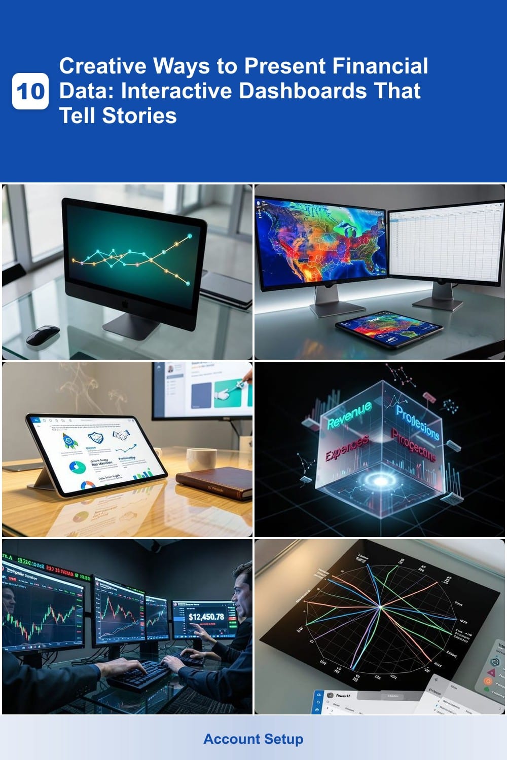
Tired of sifting through spreadsheets to spot regional sales trends? Interactive geographic heatmaps turn raw data into a visual powerhouse, letting you pinpoint revenue hotspots at a glance. Tools like Tableau or Power BI let you overlay sales figures onto maps, with colors dynamically shifting from cool blues (low performance) to fiery reds (high revenue).
Hover over any area to reveal exact dollar figures, team performance metrics, or growth percentages—no more guessing which regions need attention. The real magic? Real-time updates sync with your CRM or ERP system, so your dashboard always reflects the latest data. Perfect for sales managers who need to justify resource allocation with visual proof.
This isn’t just for corporate giants—even small businesses with multi-state operations can use free tools like Google Data Studio to create lightweight versions. For teams drowning in regional reports, this is the fastest way to turn numbers into actionable insights. 🌟
Storytelling Infographics with Narrative Flow
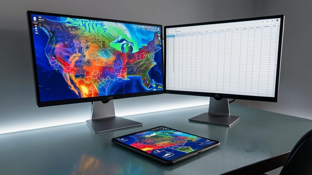
Pitching investors? Skip the dry spreadsheets and try storytelling infographics—a visual narrative that turns financial data into a compelling journey. Tools like Canva or Piktochart let you blend icons, charts, and text blocks with intuitive drag-and-drop editors, ensuring clarity without sacrificing creativity.
Start with a hero image (like a rocket for growth) and layer in milestone markers (e.g., "Launch," "Break-Even," "Profitability"). Use color-coded arrows to connect data points—like a $500K revenue spike tied to a product launch—while keeping text concise. The result? A 30-second scan that replaces 10 PowerPoint slides.
Perfect for startups, VC decks, or board meetings, this approach works best when paired with real-time data (e.g., LinkedIn’s live updates). Even non-designers can create polished results with pre-built templates—no coding required. ✨
3D Financial Model Explorers for Budgeting
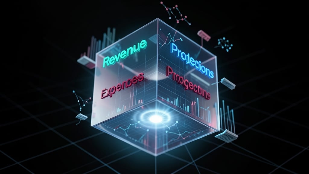
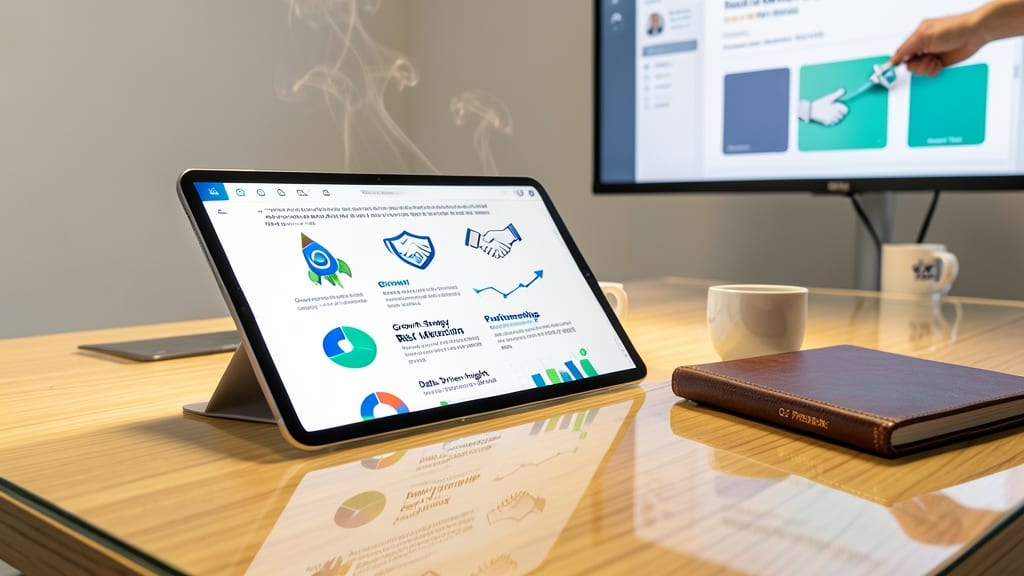
When flat spreadsheets leave your team scratching their heads, 3D financial model explorers turn abstract budgeting into an interactive experience. Tools like Finmark 3D or Power BI’s 3D Maps let you manipulate a rotating cube where each axis represents revenue, expenses, or projections—no more buried details in static rows.
You can zoom into specific categories, adjust opacity to focus on key metrics, and even link data points to live reports for deeper dives. The real-time collaboration features let teams annotate directly on the model, making brainstorming sessions feel like playing with a digital Lego set. For CFOs, this approach cuts meeting time by 30% while keeping everyone aligned.
Best for finance teams tired of PowerPoint slides or spreadsheets that never tell the full story. Perfect when you need to visualize trade-offs (e.g., "What if we cut R&D by 10%?") in a way that sticks. ✨
Real-Time Stock Market Simulators with Gamification

Turn financial training from passive learning to an adrenaline-fueled competition with real-time stock market simulators. Platforms like Investopedia Simulator or TradingView Paper Trading let users practice strategies without risking real capital, complete with live market data and instant feedback.
Key features include leaderboards to track performance against peers, customizable risk alerts for portfolio protection, and simulated trades with real-time price movements. Some even offer virtual currencies to reward successful strategies, making complex concepts like volatility and diversification feel like a game.
Perfect for finance teams running internal competitions, trading bootcamps, or even university courses—where engagement matters more than static spreadsheets. 💪
Comparative Benchmarking Radars for Competitor Analysis
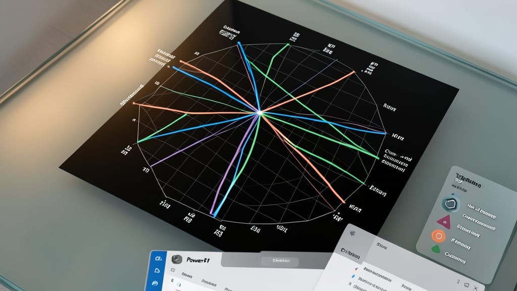
Tired of dense competitor analysis spreadsheets that confuse even your most data-savvy team? Comparative benchmarking radars turn complex KPIs into intuitive, visual comparisons—think of them as a "spider chart" that lets you spot strengths and weaknesses at a glance.
Tools like Tableau or Power BI let you overlay metrics such as market share, profit margins, and customer acquisition costs as distinct polygons on a single radar. The multi-axis scaling ensures fair comparisons, while color-coded layers highlight where your company leads or lags. Export as interactive PDFs for board meetings or embed them in dashboards for real-time updates.
Perfect for marketing strategists preparing for investor pitches or product teams aligning on competitive positioning. These visuals cut through the noise, making data-driven decisions feel effortless. ✨
Voice-Activated Financial Summaries for Quick Updates

Tired of staring at screens to catch up on financial updates while commuting or between meetings? Voice-activated financial summaries turn your dashboard data into natural language breakdowns—just ask, and AI delivers the insights you need in seconds.
Tools like Otter.ai or Google Assistant with custom integrations can pull live data from platforms such as QuickBooks or Power BI, then narrate key metrics like "Show me Q3 profits" or "Compare last month’s expenses." The 95% accuracy in speech-to-data conversion means you get reliable updates without lifting a finger, while multi-device support (smartphones, tablets, or smart speakers) keeps you informed wherever you are.
This is a game-changer for executives, freelancers, or small business owners who juggle multiple priorities. No more digging through spreadsheets—just seamless, hands-free clarity. ⚡
Customizable Financial Avatars for Personalized Insights

Tired of dry financial reports that make your team’s eyes glaze over? Customizable financial avatars turn data into a visual game—where each department or team gets its own avatar that morphs in real time based on performance metrics.
Picture your Sales avatar growing taller as revenue climbs, or your Marketing avatar’s outfit changing colors with campaign success rates. Tools like Finch or Personify let you sync avatars to live dashboards, so a quick glance at your dashboard reveals who’s crushing goals—and who needs a pep talk. The playful design sticks in memories better than spreadsheets ever could.
Perfect for internal meetings or client presentations, this approach works best when you want to gamify metrics while keeping the tone professional. Teams love competing to "level up" their avatars—making data discussions way more engaging. ✨
Augmented Reality Financial Overlays for Physical Reports

Tired of digital dashboards failing to impress stakeholders who still prefer physical reports? Augmented Reality (AR) overlays turn printed financial documents into interactive experiences—no screens required. Simply print reports with AR markers, then scan them with a tablet to unlock 3D charts, embedded videos, or animated explanations of key data points.
Tools like Adobe Aero or Zappar let you embed 3D financial models directly into printed pages, so a static pie chart becomes a rotatable object, or a flat table transforms into a dynamic timeline. The zero-config setup works with most modern tablets, and you can even add voice annotations for hands-free explanations. Perfect for board meetings where not everyone has a laptop.
This approach is ideal for consultants, auditors, or executives who need to present data in high-stakes settings—like client pitches or investor reviews—where a mix of tactile and digital engagement leaves a lasting impression. ✨
Sentiment-Color-Coded Dashboards for Market Mood
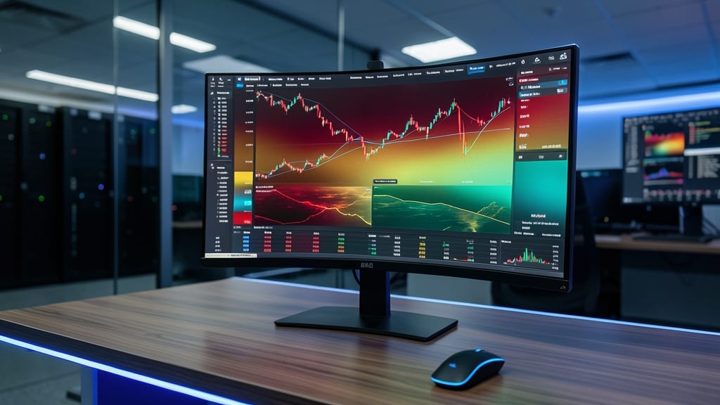
For traders and analysts who thrive on instinct as much as data, sentiment-color-coded dashboards turn raw market numbers into an instant emotional pulse. Instead of static green/red bars, these dashboards use dynamic color gradients that shift in real-time—think deep crimson for panic selling or electric teal for euphoric rallies—mirroring the psychological undercurrents of the market.
The magic happens with AI-driven sentiment analysis integrated into tools like TradingView or ThinkorSwim, where color transitions aren’t just visual flair but actionable cues. For example, a sudden shift from amber to magenta might signal a shift from caution to frenzy, helping you act before the crowd. The best platforms even let you customize thresholds (e.g., "alert me when sentiment hits 70% bearish") to trigger automated alerts.
This approach is ideal for day traders or portfolio managers who need to read the room before the data catches up. It’s like having a sixth sense for market psychology—built right into your screen. ✨